
Mailings overview
Click![]() to be able to enter a search string
to be able to enter a search string![]() so you can quickly find a specific mailing. As soon as you start typing, the results in the existing mailings list❶only shows ones that exactly match the entered characters
so you can quickly find a specific mailing. As soon as you start typing, the results in the existing mailings list❶only shows ones that exactly match the entered characters
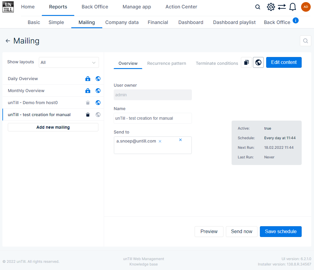
- In the column on the left side❶a list of existing mailings is displayed
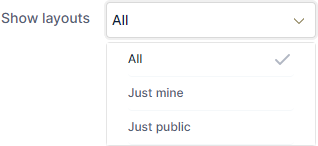
- With the drop down menu you can set which mailings you want to be displayed
-
- All → all existing mailings are displayed
- Just mine → only the mailings you (the logged in user) created are displayed
- Just public → only the mailings that are classified as public are displayed
-
- Each mailing in the list is a separate line displaying the name of the mailing and two icons
- this indicates that the mailing cannot be deleted
- this indicates that the mailing is public, i.e. visible for all users
- this indicates that the mailing isn’t public, i.e. only visible for you
- by pressing this icon you can delete the selected mailing
- When you press the icon it changes to Yes No
- Press Yes if you want to delete the selected mailing
- A pop up appears asking you to confirm or cancel removing the mailing
- Press No to immediately cancel removing the selected mailing and the icon changes back to

- Press Yes if you want to delete the selected mailing
- When you press the icon it changes to Yes No
![]() when you click this button a new mailing is added to the list, you can edit its parameters in the overview section
when you click this button a new mailing is added to the list, you can edit its parameters in the overview section![]()
1
2
1
Existing mailings
2
Parameters of the selected mailing
Create and schedule mailing
- Select an existing/newly created mailing from the list, you can only edit when User owner shows your user name
- You are allowed to duplicate public mailings that belong to another user, so you own an exact copy you can edit
- Via the subsections❶you can enter or edit the name and schedule of the selected mailing
- With the buttons you can enter/edit the content of the mailing
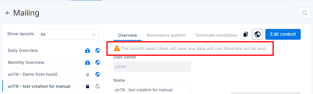
Note that even though a schedule is set, mailings will not be sent to the email address when there is no content❷
1
2
1
Subsections
2
Empty content message
![]()
In this subsection you can view and adjust the overall info for the selected mailing
- User owner → this field displays the user who owns the mailing, only this user can edit this mailing. Another user may be able to duplicate this mailing and adjust the duplicate
- Name → in this field you can see the name of the selected mailing
- Select the field to be able to adjust the name
- Send to → In this field you can see to whom the mailing is sent
- Click in the field to enter more email addresses
- With x next to the email address you can remove the specific address
- With x in the top right of the field, you can clear all entered email addresses at once
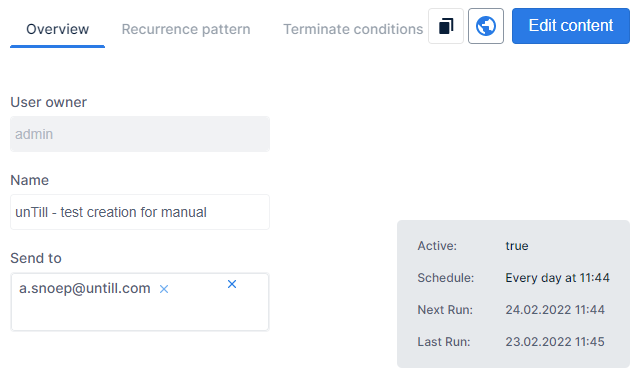
- In the overview block❶a short summary of the mailing settings is displayed
- Active: → shows whether the mailing schedule is currently activated
- True → the mailing is sent according to its schedule
- False → the mailing is not sent at all
- Schedule: → this shows the schedule used for sending the mail
- Next Run: → this shows the date and time of the next time the mailing will be sent
- Last Run: → this shows the date and time the last time the mailing was sent
- Active: → shows whether the mailing schedule is currently activated
1
1
Overview block
![]()
In this subsection you can enter a schedule that is used to send the selected mailing
- None → enable the radio button when you want to disable the schedule, the mailing will not be sent. In other words the mailing is not active anymore
- Daily → enable the radio button to indicate that you want the mailing to be sent on a daily basis
- Is active when the slider is enabled, the mailing is sent according to its schedule
- Start at you can specify a date and time at which the daily mailing is sent
- Select the field and enter a date and/or time
- Or click
 to select a date and time on the calendar
- Send every with this field you can indicate that the mailing should be sent every 1,6,45, etc days/weeks/months/years
- Which periodic interval is used depends on the active radio button
- Select the field and enter the number
- Or use the up ∧ and down ∨ arrows to adjust the number
- E.g. if you enter 22, the report will be emailed every 22 days/weeks/months/years
- Weekly → enable the radio button to indicate that you want the mailing to be sent on a weekly basis
- In addition to the settings that are the same as with the daily period, you can set specific days of the week when the mailing will be sent
- If you set send every 2 weeks and select ‘Mon’, ‘Wed’, and ‘Fri’, for example, the report will be mailed every two weeks on Monday, Wednesday, and Friday
- In addition to the settings that are the same as with the daily period, you can set specific days of the week when the mailing will be sent
- Monthly → enable the radio button to indicate that you want the mailing to be sent on a monthly basis
- In addition to the settings that are the same as with the weekly period, you can choose to send the report on a specific day of the month
- Send on specific day of the month when the slider is enabled you can set a specific day of the month that the report will be sent
- When the slider is enabled, you can select which weekday is used
- E.g. Send every 2 months, 2nd and Tue are selected → the report is sent every two months on the second Tuesday of the month
- When the slider is enabled, you can select which weekday is used
- Yearly → enable the radio button to indicate that you want the mailing to be sent on a yearly basis
- In addition to the settings that are the same as with the monthly period you can also select the specific month when the report will be sent
- Send on specific day of the year when the slider is enabled you can set the choose the month, and which weekday is used
- E.g. Send every 1 year, Mar, 3rd, and Wed are selected → the report is sent every third Wednesday in March


![]()
- Repeat forever → enable this radio button to indicate that the recurrence pattern will be executed indefinitely
- Set terminate condition → enable this radio button to be able to set when no reports are mailed anymore. You can choose to end the mailing after a certain number of reports or after a specific date
- Report number → click in the field or use the up ∧ and down ∨ arrows to enter a maximum number of reports that will be sent
- E.g. if you enter 20, the mailings are sent 20 times in accordance with the recurrence pattern
- The bottom line displays the number of reports already sent
- Specific date → Select the field or clickcalendar to select and set a date and time, after which no reports will be sent anymore
- Report number → click in the field or use the up ∧ and down ∨ arrows to enter a maximum number of reports that will be sent
- Press this button to copy an existing mailing
- The newly created mailing is added to the list with the name of the original and ‘Copy’ added to it
- You can alter name, addressee, and recurrence pattern
- Before you can edit the content you need to save the mailing with the button
- Press this button to indicate that the mailing will not be visible for other users
- Press this button to indicate that the mailing will be visible for other users
![]() Press this button to edit the report content that will be sent to the addressee
Press this button to edit the report content that will be sent to the addressee
![]() Press this button to see a preview of the report content
Press this button to see a preview of the report content
![]() Press this button to send the report mailing now instead of waiting for the next time it is scheduled
Press this button to send the report mailing now instead of waiting for the next time it is scheduled


Edit content
In this section you can indicate which overviews are displayed in the emails
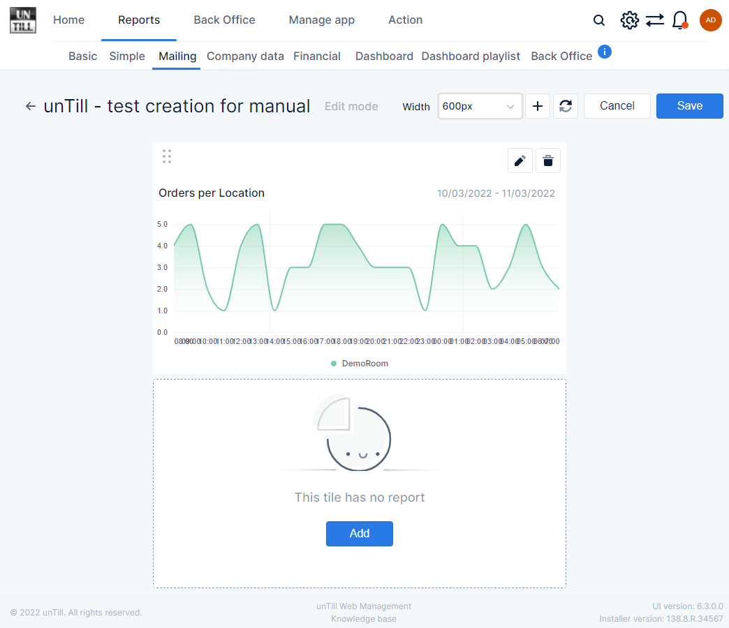
- Select the mailing for which you want to edit its content and press
- The content overview for the selected mailing is shown❶
- With
 you return to the previous page
 - The name of the mailing, from which you are editing the content, is displayed
- Width → here you can set the width of the report tile(s)❷that are shown in the mailing
- Click the field or down arrow to view the drop down menu and choose the width you want: 600 px or 1000px
- With
- Press this button to add a report tile❷
- Press this button to renew the page’s data
![]() Press this button to cancel editing and return to the previous page without saving
Press this button to cancel editing and return to the previous page without saving
![]() Press this button to save the content for the mailing
Press this button to save the content for the mailing
![]() Press this button to add content for a new tile
Press this button to add content for a new tile
- Press this button to edit the content of existing tiles
- Press this button to remove an existing report tile from the mailing
1
2
1
Info line
2
Report tiles that will be mailed
Edit report tile
In the pop up that opens when you used![]() or
or![]() you can set the data that will be displayed on the report tile. It is divided in subsections. You can use
you can set the data that will be displayed on the report tile. It is divided in subsections. You can use![]() and
and![]() to navigate through the different subsections. With
to navigate through the different subsections. With![]() you can return to the previous page, but you lose all your changes. With
you can return to the previous page, but you lose all your changes. With![]() you return to the previous page and the changes you made are saved
you return to the previous page and the changes you made are saved
Report selection
In the report section you can choose which report you want to display on the tile and how you want it to be represented
- In the left column❶you can choose the report from which you want the data to be shown
- The reports are arranged in subsections:
- Sales → shows reports that contain data about sales and orders
- Time → shows reports that contain data related to time
- Other → shows reports that contain miscellaneous data
- The name of the report you selected is shown at the top of the form
- A short description of the selected report is shown at the bottom of the column❷
- In the middle column❸you can select the way in which the data will be displayed. Per report these may vary
- Total → data is shown as numbers
- Grid → data is shown in a grid of rows and columns
- H. Bar (Horizontal bars) → data is represented in a horizontal bars diagram
- V. Bar (Vertical bars) → data is represented in a vertical bars diagram
- Donut → data is represented in a donut diagram
- Pie → data is represented in a pie diagram
- Gauge → data is represented by a gauge
- Tile Grid → data is shown in separate tiles
- Bar Grid → data is shown in a bar grid
- Line → data is represented by a line in a diagram
- Area → data is represented by a coloured area in a diagram (basically the same as the line diagram only the area below the line is coloured)
- In the right column❹you can see a preview of the way the report will be displayed (data in the preview might not be an actual representation)
- With ❯ Hide preview you can hide the preview field
- With ❮ Show preview you can have the preview shown again
1
2
3
4
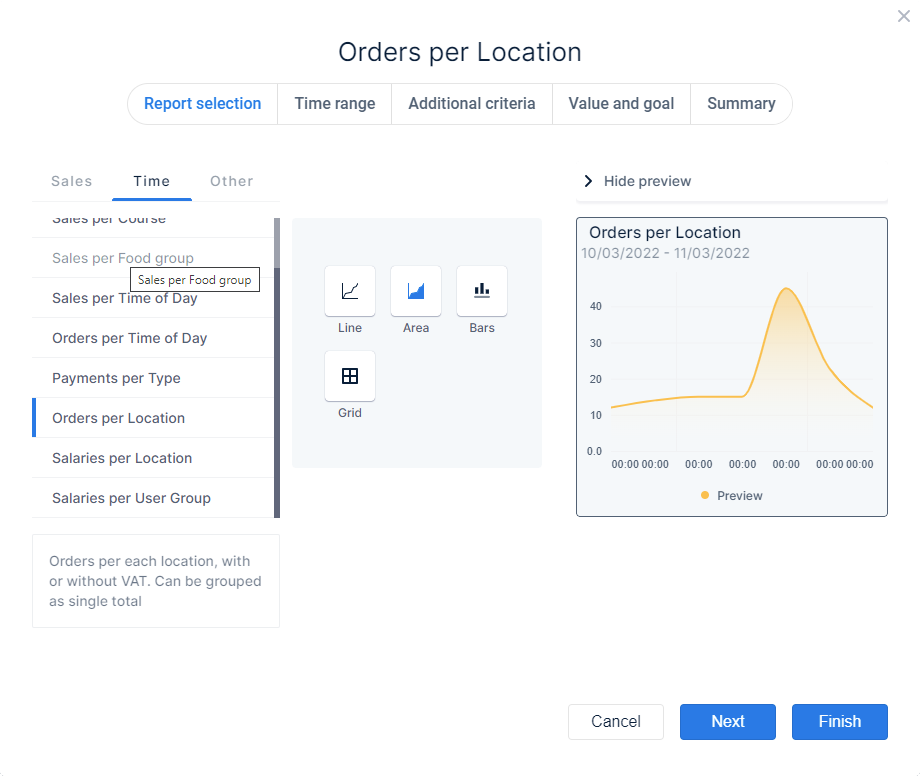
1
Reports to choose
2
Description of selected report
3
Layout choices
4
Preview of the tile
Time range
In this section you can set the time range for which the data in the report is shown
- For most reports you can set the time range that is used for generating the data
- Default this is set to ‘Today’, which means start of the working hours up to the current time
- In the left column❶you can choose predefined or create custom time ranges according to time periods❷
- You can set the period to:
- Days, Weeks, Months, Quarters, Years, and Hours
- The predefined and custom ranges will correspond with the chosen time period
- E.g. Time period is ‘Days’ you can choose time range ‘Last 3 days’, time period is ‘Weeks’ you can choose time range ‘Last 3 weeks’, etc
- The predefined and custom ranges will correspond with the chosen time period
- Accounting
- You can choose a template that is used to divide quarters
- 5-4-4 → one quarter = 5 weeks, 4 weeks, 4 weeks
- 4-5-4 → one quarter = 4 weeks, 5 weeks, 4 weeks
- 4-4-5 → one quarter = 4 weeks, 4 weeks, 5 weeks
- You can choose a template that is used to divide quarters
- In the middle column❸you can define the custom time range you want to set
- Drag either or both
 to the left and right across the bar, to set the time range according to the chosen time period
 - In the example picture the custom time range is set to start 11 days ago and end today
- Drag either or both
- When you created a custom time range you can save it for future use
- Press
- The field changes to
 click in the field to enter a name
 - Press
 to confirm and save the custom time range
 - Press
 to cancel saving the custom time range. It will not be available in the future
- Press
- The preview❹doesn’t change according to the chosen time range, it is just shown as an example of the chosen diagram view. You can click Hide preview to remove it
1
2
3
4

1
Various time ranges
2
Divisions for selected time range
3
Possibility to set custom time range division
4
Preview
Additional criteria
In this section you can set more criteria that influence the data that is shown
- When there is more than one criterion you can choose for a report you can select it via the tab divisions❶
- In the content section of the selected criterion you can change the parameters❷
- Depending on the report you selected you can choose various criteria
- Locations
- Articles
- Categories
- Departments
- Main groups
- Users
- User groups
- If you want certain articles, locations, etc to be taken into account, make sure the corresponding checkboxes for these are enabled, for items with disabled checkboxes no data will be displayed
- When the additional criterium you are viewing contains a lot of items you can use
 to quickly find what you are looking for
 - You can also create a custom set of chosen items for future use by clicking ╂ Create new set
- Without zeros → enable the checkbox to leave out data without an amount
- Show locations → enable the checkbox to have the data shown per location, if the checkbox is disabled the total for all locations is displayed
- Show sales areas → enable the checkbox to have the data shown per sales area, when the checkbox is disabled data is summarised for all sales areas
- Discounts without reason → enable the checkbox to show the discounts for which no discount reason was entered
- Voids without reason → enable the checkbox to show the voids for which no void reason was entered
1
2
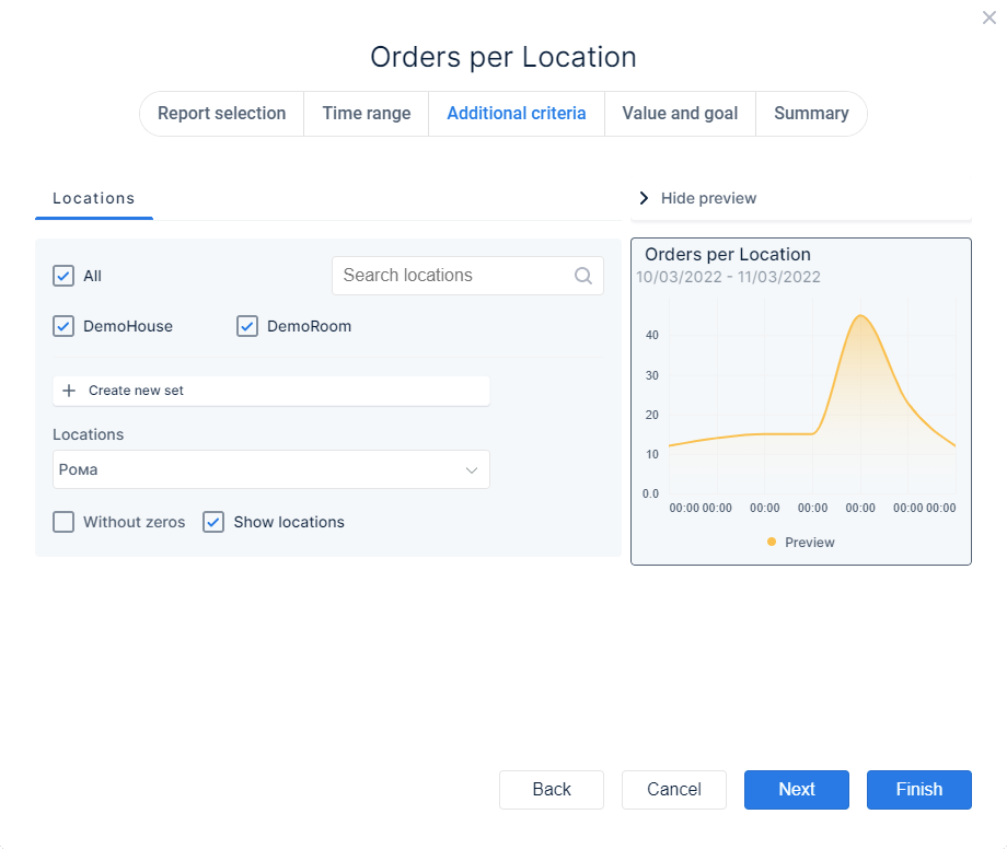
1
Additional criteria you can choose
2
Settings for the selected criterion
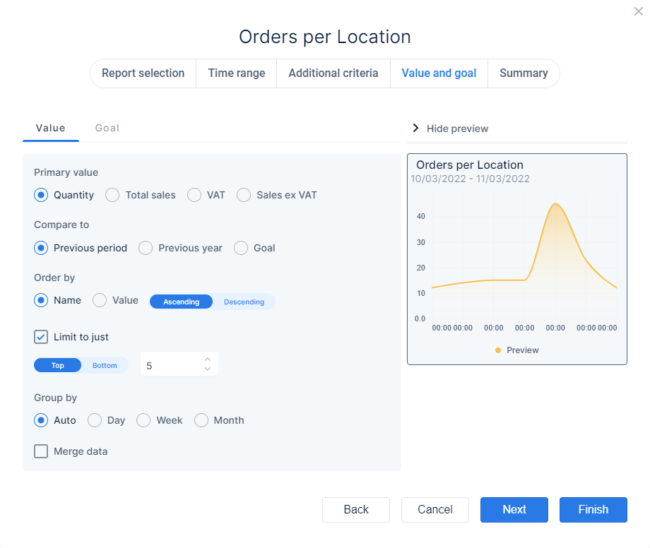
Value and goal
In this section you can set which values you want to have shown, you can also set a goal that you want to reach in the report period
Value
The parameters you can choose depend on the selected report
- Primary value → enable the radio button
 of the corresponding value which will be used as primary value, i.e. the value that will be compared to another value
- Show value as percentage of total → enable this checkbox to have field showing the value as percentage of the primary value
- Compare to → enable the radio buttonof the corresponding value that will be used to compare the primary value with
- Compare as → choose the way in which you want the difference shown
- Delta → the difference is shown as a number when this is enabled
- Percentage → the difference is shown in percentages when this is enabled
- Order by → you can choose the sequence in which the results are shown
- Name → data is arranged alphabetically according to the name of the primary value
- Value → data is arranged according to the quantity of the primary value
You can also further specify the sequence by setting the slider to the desired state- A-Z or 1-10
- Z-A or 10-1
- Limit to just → when you enable the checkbox you can limit the number of results that are displayed. Put the slider in the desired state
- → the top most results are shown
- → the bottom most results are shown
- Enter/change the number of items you want to show
- Group by → you can have certain data grouped, enable the radio button corresponding with the manner of grouping
- Auto → data is grouped automatically
- Day → data is grouped per day
- Week → data is grouped per week
- Month → data is grouped per month
- Merge data → enable the checkbox to have the combined data displayed, with the checkbox disabled data is shown per location, for example
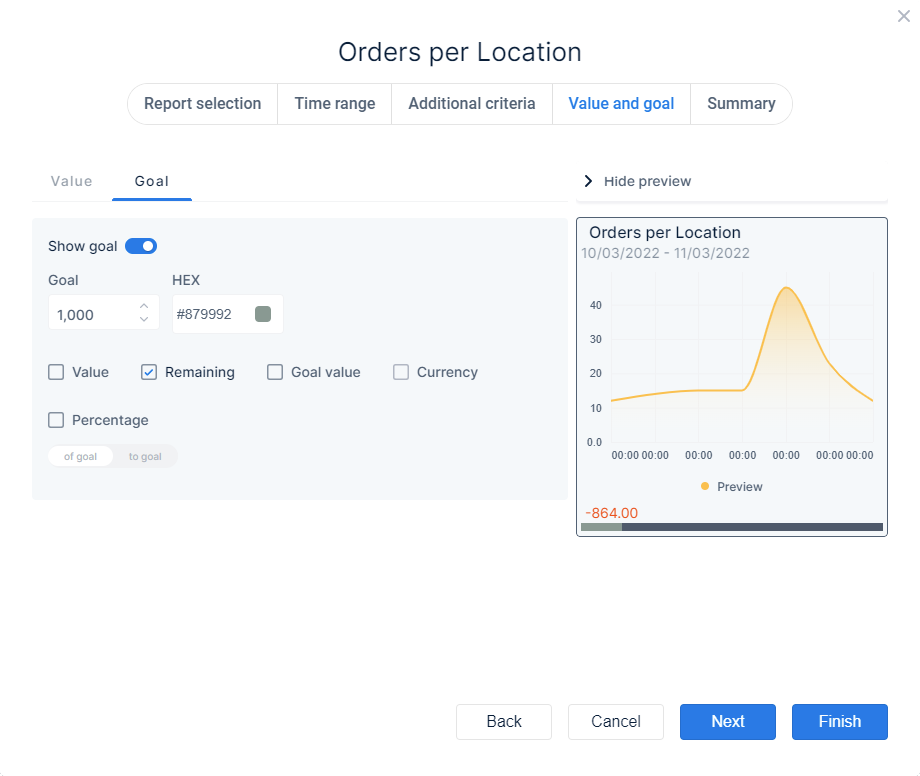
Goal
You can set a goal to which the value is compared
- Show goal → enable the slider to be able to set/change the goal and have it displayed
- Goal → set the amount you want to set as goal, to which data can be compared
- HEX → click in the field to set the colour that is used to show how much of the goal is reached as progress bar❶
- Value → enable the checkbox to show the current value
- Remaining → enable the checkbox to show the amount needed to reach the goal
- Goal value → enable the checkbox to show the amount you set as goal
- Currency → enable the checkbox to show amounts with the currency symbol
- Percentage → enable the checkbox to show the percentage in reference to the goal
- → the percentage shows how much of the goal you already reached
- → the percentage shows how much you still need to reach the goal
1
1
Goal line
Summary
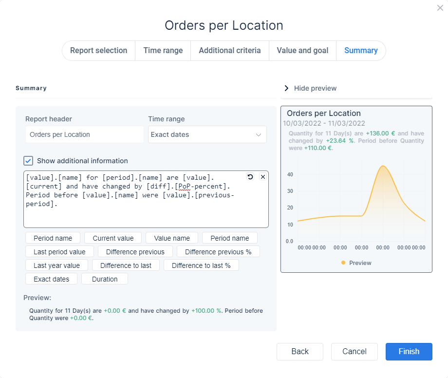
Here you can view. change and/or add various report settings
- Report header → the field shows the name of the report you selected, click the field to be able to adjust it
- Time range → from the drop down menu you can choose how the time range is displayed
- Exact dates → the start and end date are shown (10/03/2022 – 11/03/2022, for example)
- Duration → the name for the period is shown (Yesterday, for example)
- Load time → the time the data was loaded (14:53, for example)
- Hidden → the time range is not shown
- Show additional information → you can enable the checkbox so more information is shown on the tile
- You can remove the additional info fields by selecting and deleting them one by one❶or use
 to remove all items at once. With
 you can revert the last alteration
 - You can select more info fields that are shown on the report tile❷
- You can remove the additional info fields by selecting and deleting them one by one❶or use
1
2
1
Additional information field
2
Additional information to add
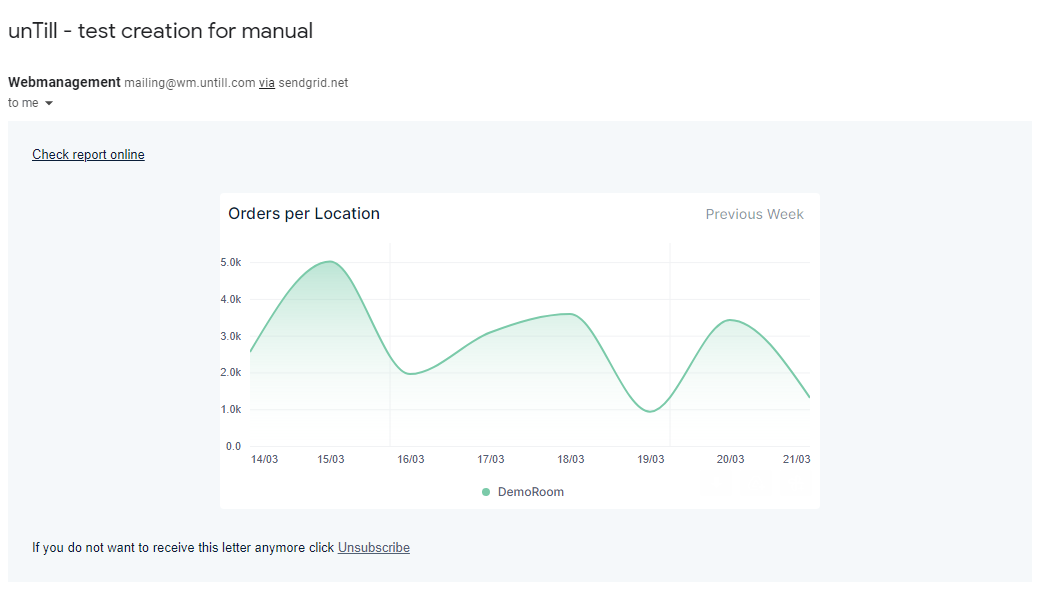
Example mailing
- The tile(s) display the report data according to the settings❶
- When you want to view the data in the online Web Management environment you can click the link ‘Check report online’❷
- From the mail you can easily unsubscribe the receiver’s mail address with the link ‘Unsubscribe’❸
- Note that when you use the link you are immediately unsubscribed and will not be receiving the report anymore on the current email address
1
2
3
1
Report diagram
2
Link to online report
3
Link to indicate that you want to stop receiving the report mailing