
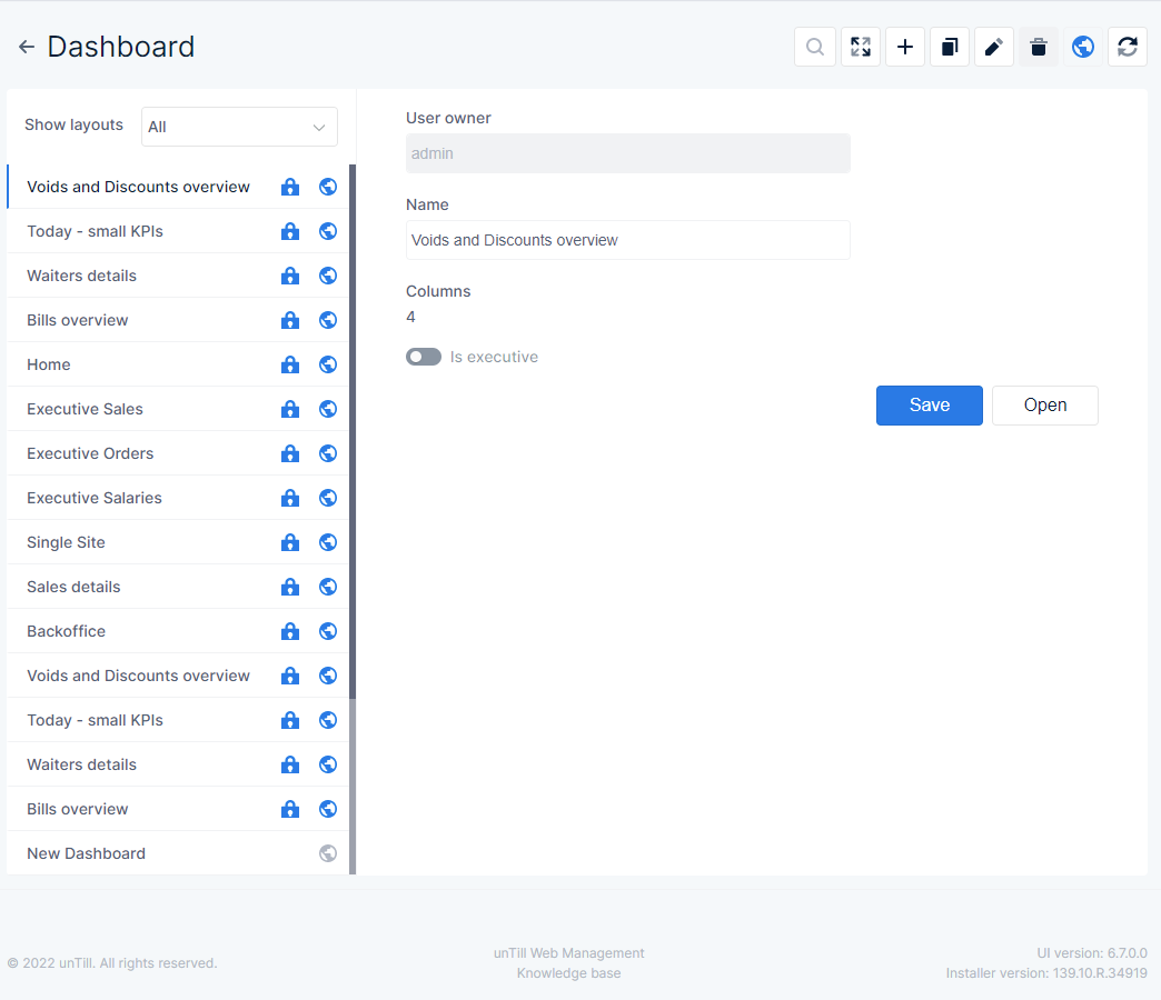
Dashboard main page
- The column on the left❶shows an overview of existing dashboards
- From the drop down menu Show layouts you can choose which dashboards you want to have in the list
- All → all dashboards are shown
- Just mine → only dashboards the current user created are shown
- Just public → only dashboards that have been labeled ‘Public’ are shown
- Note that dashboards you created but that aren’t public, are also not shown in this modus
- Indicates that the dashboard cannot be deleted
- Indicates that the dashboard is publicly available
- Indicates that the dashboard is not publicly available
- From the drop down menu Show layouts you can choose which dashboards you want to have in the list
- With the buttons❷you can indicate what you want to do with the selected dashboard
- When you press the search icon you can enter a search string that will show you only the dashboards that match the string
- When you press the full screen icon the selected dashboard is shown full screen
- With this icon you can add a new dashboard
- When you press this icon the selected dashboard is copied
- By pressing this icon you can delete the selected dashboard
- When this icon is displayed the selected dashboard is not publicly available, only for the user that created this dashboard (you). Press this button to make the selected dashboard publicly available
- When this icon is displayed the selected dashboard is publicly available. When you press the button the selected dashboard will not be public anymore
- Press this icon to refresh the data
- You can view general information for the selected dashboard in the overview❸
- User owner → in the field you can see which user created the selected dashboard
- Name → in this field you can see and enter/edit the name for the selected dashboard
- Columns → here you can see the maximum number of columns in which the selected dashboard can be split
- Is executive → when this is enabled the time range can be adjusted when a user opens the dashboard
1
2
3
1
Available dashboards
2
Buttons
3
Overview of selected dashboard
![]() With this button you can save the settings for the selected dashboard
With this button you can save the settings for the selected dashboard
![]() With this button you can open and view the selected dashboard ❹
With this button you can open and view the selected dashboard ❹
-
- When the slider ‘Is executive’ is enabled
 you can adjust the time range in the dashboard❺
- Press
 to be able to adjust start and/or end date/time
- Press
- You can also zoom in❻by choosing an enlargement percentage from the drop down menu
- When the slider ‘Is executive’ is enabled
1
2
3
4
5
6
4
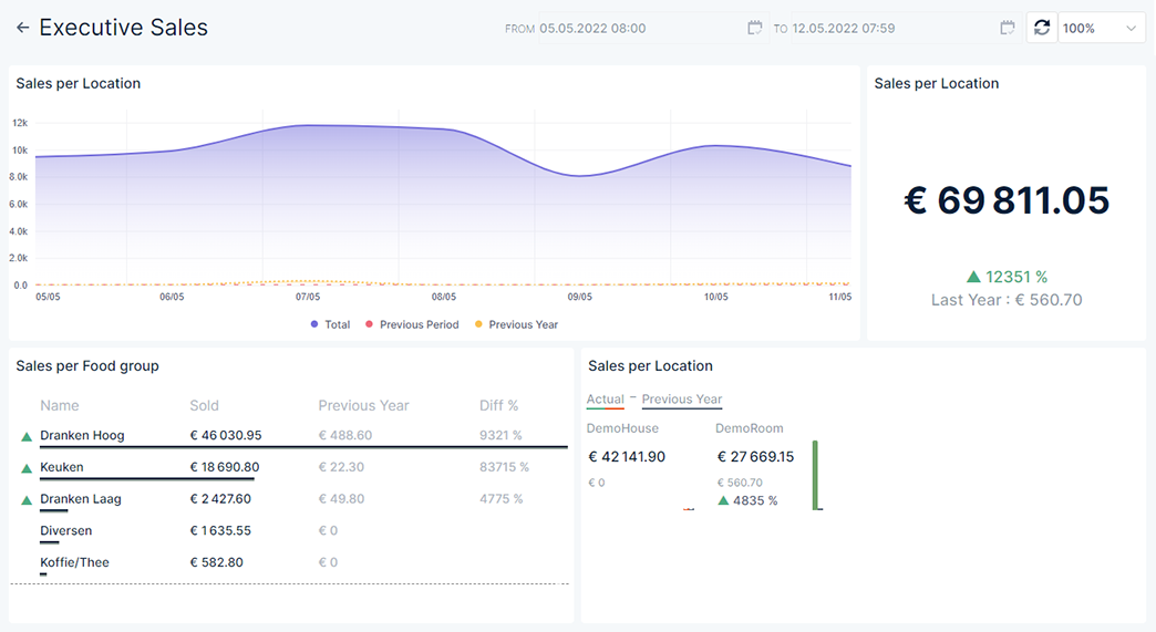
Example of a dashboard
5
Change time range
6
Zoom in
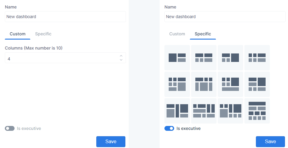
New dashboard
- You can create a new dashboard in two ways
- Press
 to create a new blank one
- The dashboard will be at the bottom of the list named ‘Dashboard X’ (X = a number assigned according to the amount of new dashboards with this name there already are), ‘Dashboard 3’ for example
- Press
 to duplicate the dashboard that is currently selected
- The dashboard will be at the bottom of the list with the same name as the one it was copied from but with ‘duplicate’ added to the name, ‘Home duplicated’ for example
- The dashboard will also already contain the same tiles and settings as the ‘original’ one, these can be adjusted
- Press
- Click in the field ‘Name’ to adjust the name of the dashboard
- Choose the layout for the dashboard
- Custom → the number of columns you enter here is the maximum of which the dashboard can consist❶
- E.g. 4 means that you can divide the dashboard in 1, 2, 3, and/or 4 columns
- The maximum number of columns is ten
- Specific → examples of tile layouts is given from which you can choose❷
- Click a layout that meets your wishes to select it
- Custom → the number of columns you enter here is the maximum of which the dashboard can consist❶
- Press
 to save the dashboard
 - Now you can edit the dashboard to add/change the tiles that will be displayed when the dashboard is shown
1
2
1
Custom tile layout
2
Suggested layouts
Edit dashboard
The dashboard consists of one or more tiles that show you the information you want. New dashboards don’t have any tiles yet, so you need to add them. Tiles for existing dashboards, duplicated or not, can be edited. In the following section is described how to add and/or edit the dashboard tiles to meet your wishes
- Select the dashboard you want to edit
- Press

- Existing and duplicated dashboards show the tiles it already contains❶
- When you hover the mouse over an existing tile you can expand the tile so it becomes wider or taller
- Note that when you lengthen or widen a tile, the tile that is overwritten will not be returned when widening/lengthening is undone
- When you click this button the tile width will include the full tile on the right, i.e. the tile is at least two columns wide
- When you click this button the tile width will include the full tile on the left, i.e. the tile is at least two columns wide
- When you click this button the tile height will include the full tile directly below it, i.e. the tile is at least two rows tall
- When you click this button the tile height will include the full tile directly above it, i.e. the tile is at least two rows tall
- Empty dashboards show a blank page with only the buttons❷and the name of the dashboard with the return button

- Press this button to add a header to the dashboard❸In the field you can enter the text you want to have displayed
- Press this button to add a row of new, empty tiles to the dashboard❹
- Press this button to be able to edit the content of the tiles❺
- Press this button to save the tile settings for the dashboard
- Press this button to refresh the page
- Whenever this icon is displayed you can press it to delete the corresponding element
- You can remove a full row of tiles by pressing the text ‘Remove row’❻
1
2
3
4
5
6
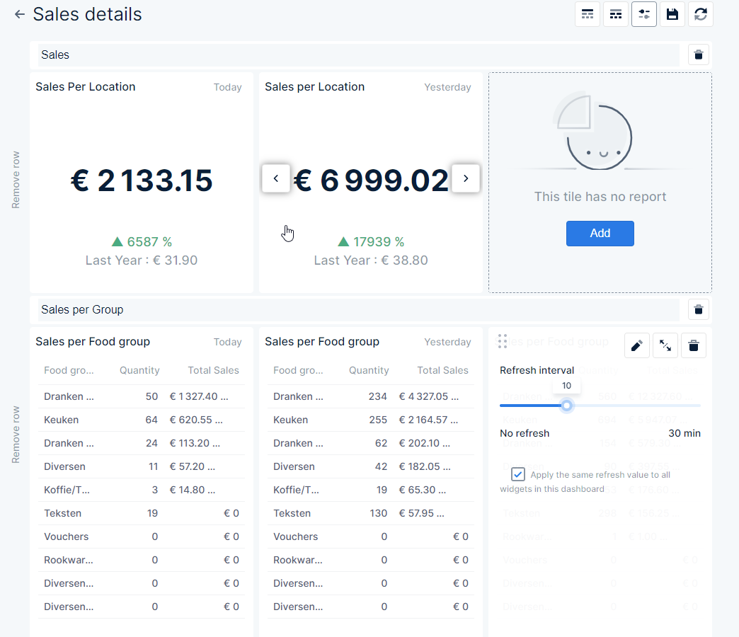
1
Existing tile
2
Buttons
3
Header
4
Empty tile
5
Edit the tile
6
Remove full row
Edit tile
The tiles show report information. By editing the tile you can indicate which data is shown and how it is displayed
- While you are still in the dashboard main page, you can edit certain aspects of the tile❶
- When you click and hold the mouse on⁝⁝you can drag and drop a tile on top of another tile. The result is that both tiles will have traded places
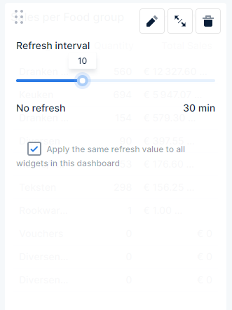
- You can set a refresh interval for the tile by dragging
 across the line
- Drag it all the way to the left to have no refresh at all, the dashboard tile will only be refreshed when the dashboard is loaded again
- Drag it all the way to the right to have the dashboard refresh after thirty minutes of displaying
- Or place it anywhere on the line to set the refresh to the corresponding number of minutes
- The tooltip shows how many minutes the place on the line represents
- Tiles that have been widened or lengthened (combined) can be split with

- A free, empty tile will be the result
- To remove the tile press

- To set the parameters that are used for displaying the info on the tile
- Press
 on the empty tile
 - Pressfor existing tiles
- Press
1
1
Edit existing tile
Edit tile parameters
The info the tiles display on the dashboard is basically a quick view of a report. Just as with the reports you need to set the parameters of what you want the tile to display. Which parameters can be set also depends on the report that is chosen. Below an overview of most parameters that may be available
- You can use
 to go to the following parameter section, or select the subsection you want directly from the menu on the top of the form
 - Press
 to go back the previous parameter section
 - If you press
 the parameters you set up to this point are saved and the rest of the parameters are left default
 - Press
 to close the tile editor without any changes (all changes you made up to this point will be lost)
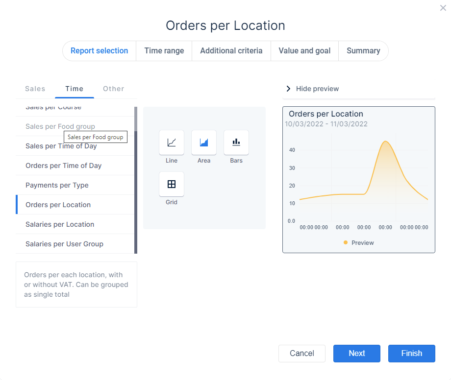
Report selection
- In the left column❶you can choose the report from which you want the data to be shown
- The reports are arranged in subsections:
- Sales → shows reports that contain data about sales and orders
- Time → shows reports that contain data related to time
- Other → shows reports that contain miscellaneous data
- The name of the report you selected is shown at the top of the form
- A short description of the selected report is shown at the bottom of the column
- In the middle column❷ you can select the way in which the data will be displayed. Per report these may vary
- Total → data is shown as numbers
- Grid → data is shown in a grid of rows and columns
- H. Bar (Horizontal bars) → data is represented in a horizontal bars diagram
- V. Bar (Vertical bars) → data is represented in a vertical bars diagram
- Donut → data is represented in a donut diagram
- Pie → data is represented in a pie diagram
- Gauge → data is represented by a gauge
- Tile Grid → data is shown in separate tiles
- Bar Grid → data is shown in a bar grid
- Line → data is represented by a line in a diagram
- Area → data is represented by a coloured area in a diagram (basically the same as the line diagram only the area below the line is coloured)
- In the right column❸you can see a preview of the way the report will be displayed (data in the preview might not be an actual representation)
- With ❯ Hide preview you can hide the preview field
- With ❮ Show preview you can have the preview shown again
1
2
3
1
Reports you can choose
2
Choose how the data is shown
3
Example of how the data is shown
Time range
- For most reports you can set the time range that is used for generating the data
- Default this is set to ‘Today’, which means start of the working hours up to the current time
- In the left column❶you can choose predefined or create custom time ranges according to time periods❷
- You can set the period to:
- Days, Weeks, Months, Quarters, Years, and Hours
- The predefined and custom ranges will correspond with the chosen time period
- E.g. Time period is ‘Days’ you can choose time range ‘Last 3 days’, time period is ‘Weeks’ you can choose time range ‘Last 3 weeks’, etc
- The predefined and custom ranges will correspond with the chosen time period
- Accounting
- You can choose a template that is used to divide quarters
- 5-4-4 → one quarter = 5 weeks, 4 weeks, 4 weeks
- 4-5-4 → one quarter = 4 weeks, 5 weeks, 4 weeks
- 4-4-5 → one quarter = 4 weeks, 4 weeks, 5 weeks
- You can choose a template that is used to divide quarters
- In the middle column❸you can define the custom time range you want to set
- Drag either or bothto the left and right across the bar, to set the time range according to the chosen time period
- In the example picture the custom time range is set to start 11 days ago and end today
- Drag either or both
- When you created a custom time range you can save it for future use
- Press
- The field changes to
 click in the field to enter a name
 - Press
 to confirm and save the custom time range
 - Press
 to cancel saving the custom time range. It will not be available in the future
- Press
1
2
3

1
Predefined time ranges you can choose
2
Time periods you can choose
3
Here you can set a custom time range
Additional criteria
- For most report choices you may also indicate whether the data should include/exclude certain parameters
- The various criteria that may be available are:
- Locations
- Articles
- Categories
- Departments
- Main groups
- Users
- User groups
- If you want certain articles, locations, etc to be taken into account, make sure the corresponding checkboxes for these are enabled, for items with disabled checkboxes no data will be displayed
- When the additional criterium you are viewing contains a lot of items you can use
 to quickly find what you are looking for
 - You can also create a custom set of chosen items for future use by clicking ╂ Create new set
- Without zeros → enable the checkbox to leave out data without an amount
- Show locations → enable the checkbox to have the data shown per location, if the checkbox is disabled the total for all locations is displayed
- Show sales areas → enable the checkbox to have the data shown per sales area, when the checkbox is disabled data is summarised for all sales areas
- Discounts without reason → enable the checkbox to show the discounts for which no discount reason was entered
- Voids without reason → enable the checkbox to show the voids for which no void reason was entered
1
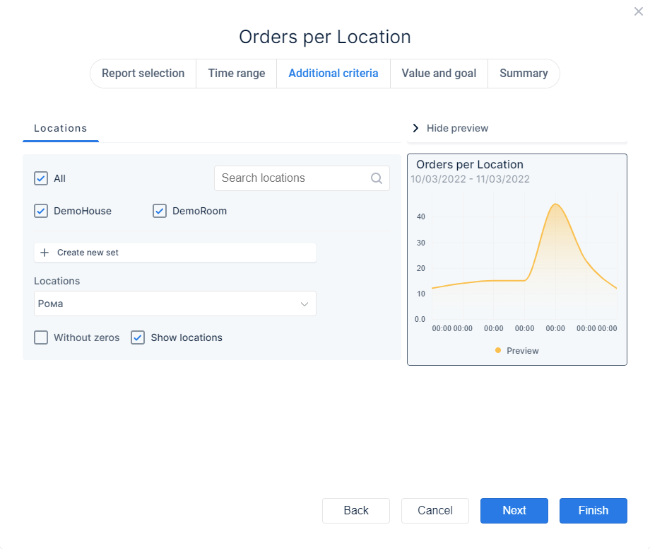
1
Additional parameters you can also choose
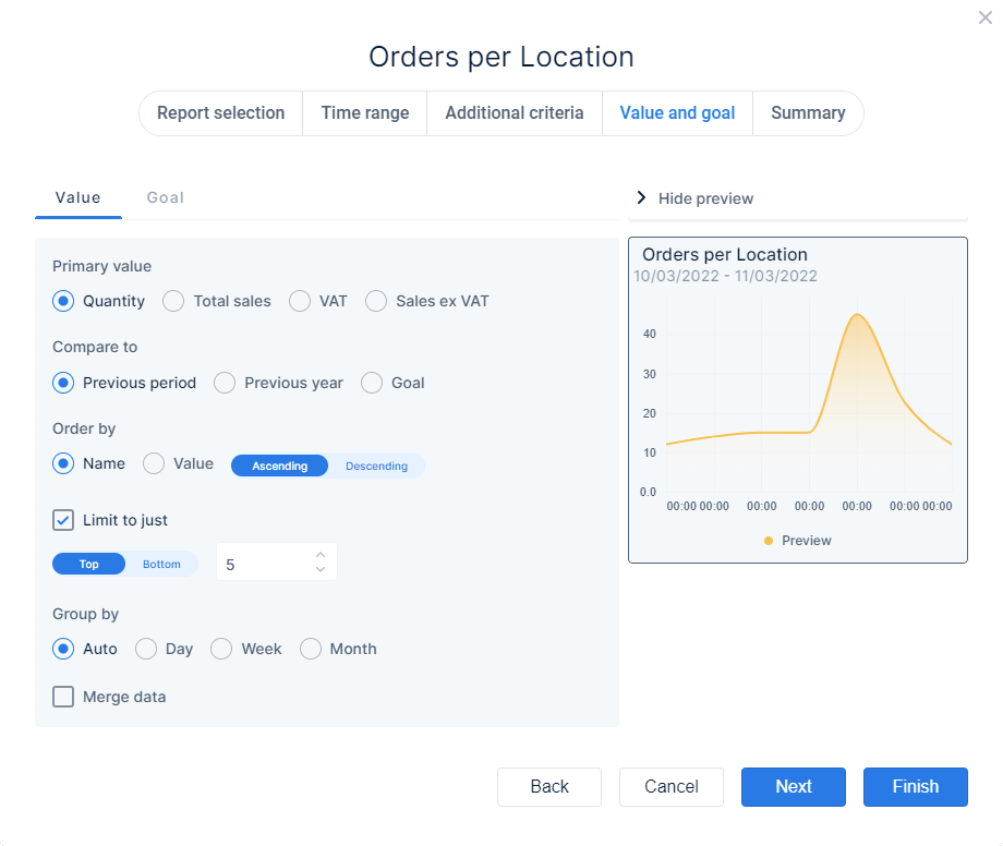
Value and goal
For a number of report choices you can compare the output value to a previous value or a specified goal. You can set which values are compared to which previous values in the Value section. Which value parameters are available depends on the report choice and also on the way it is displayed. And you can set a target in the Goal section
Value
- Primary value → enable the radio button
 of the corresponding value which will be used as primary value, i.e. the value that will be compared to another value
- Show value as percentage of total → enable this checkbox to have field showing the value as percentage of the primary value
- Compare to → enable the radio buttonof the corresponding value that will be used to compare the primary value with
- Compare as → choose the way in which you want the difference shown
- Delta → the difference is shown as a number when this is enabled
- Percentage → the difference is shown in percentages when this is enabled
- Order by → you can choose the sequence in which the results are shown
- Name → data is arranged alphabetically according to the name of the primary value
- Value → data is arranged according to the quantity of the primary value
You can also further specify the sequence by setting the slider to the desired state- A-Z or 1-10
- Z-A or 10-1
- Limit to just → when you enable the checkbox you can limit the number of results that are displayed. Put the slider in the desired state
- → the top most results are shown
- → the bottom most results are shown
- Enter/change the number of items you want to show
- Group by → you can have certain data grouped, enable the radio button corresponding with the manner of grouping
- Auto → data is grouped automatically
- Day → data is grouped per day
- Week → data is grouped per week
- Month → data is grouped per month
- Merge data → enable the checkbox to have the combined data displayed, with the checkbox disabled data is shown per location, for example
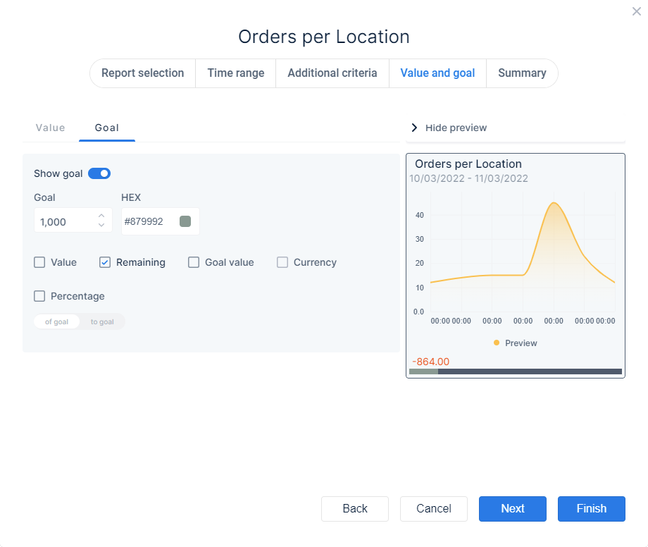
Goal
- Show goal → enable the slider to be able to set/change the goal and have it displayed
- Goal → set the amount you want to set as goal, to which data can be compared
- HEX → click in the field to set the colour that is used to show how much of the goal is reached as progress bar
- Value → enable the checkbox to show the current value
- Remaining → enable the checkbox to show the amount needed to reach the goal
- Goal value → enable the checkbox to show the amount you set as goal
- Currency → enable the checkbox to show amounts with the currency symbol
- Percentage → enable the checkbox to show the percentage in reference to the goal
- → the percentage shows how much of the goal you already reached
- → the percentage shows how much you still need to reach the goal
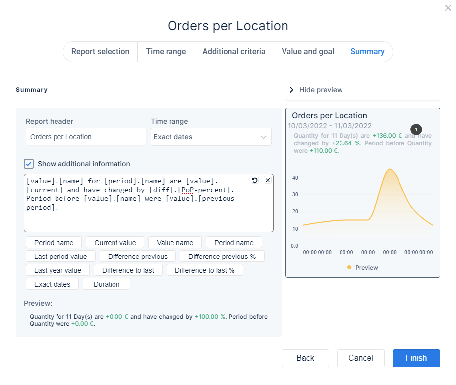
Summary
In this section you can view/change overall settings and add some additional information you also want displayed on the tile
- Report header → default this shows the name of the report you selected, you can adjust it
- Time range → from the drop down menu you can choose the way the time range is shown on the tile
- Exact dates → shows the start and end date (e.g. 10/03/2022 – 14/03/2022)
- Duration → shows the name for the period (e.g. Today, Current Week, etc)
- Hidden → the time range that is used isn’t shown on the tile
- Show additional information → when the checkbox is enabled you can add additional fields in the selection frame. The corresponding info for the fields is displayed on the tile as a textual summary, as displayed in the Preview❶
- To delete one ore more fields from the selection frame, simply select it or place the cursor at the end of the field and delete it with the keyboard
- With
 you can delete all fields in the selection frame
 - With
 you can revert the changes you made to the default status
1
2
1
Preview
2
Preview