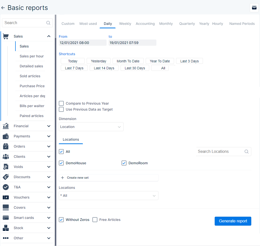
Report settings
- Press this icon to see an overview of all report mailings that are scheduled for the selected subsection
![]() Entering a search string in this field results in showing you only the reports that exactly match the search
Entering a search string in this field results in showing you only the reports that exactly match the search
- In the left column❶you can choose predefined reports, these reports are divided per category
- For example:
- Sales shows reports of all paid orders/articles, which waiter closed the bill, etc
- Orders shows reports of which articles were ordered, by who, when, etc
- Discounts shows reports of the total amount of discount given, and per waiter
- Click on a category to view which reports are available within this category
- Which report you selected can be recognised by a coloured indicator mark and the text is bold
 This indicates that ‘Sales‘ report is selected
- On the right side you can define the specific parameters that are used to generate the selected report
- The screen is divided in different tabs❷to quickly allow you to choose between the various time ranges
- Per time range and subject the parameters vary, you can set the the parameters for each on the various tabs❸
 Press this button to create the report according to the parameters you set
1
2
3
Time range
When you have chosen the report type, you can define the time range that is used to generate the report. Only data that is within the time range is used on the report
Custom
- You need to define a start date&time in the ‘From’ section and an end date&time in the ‘To’ section
- The way in which the date & time are set, is the same in both sections
- The highlighted day on the calendar is the day that is selected for the section
- You can press another date to select it
- You can also click the month and year at the top of the calendar to be able to change the month and/or year
- Press once to choose one of the other months in the same year
- Press again to be able to choose another year and then select the month
- Below the calendar in each section you can set the time
- You can use the up ∧ and down ∨ arrows to change the time
- You can also select the field and enter the time on the keyboard
- The left field is for the hours and the right for the minutes
- When you press ‘Today‘, the current date&time are set
- Note that the ‘From’ date&time can’t be after the ‘To’ date&time
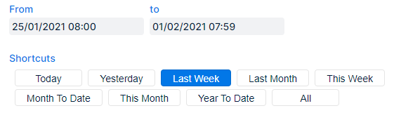
Most used, Daily, Weekly, Monthly, Quarterly, Yearly, and Hourly
On these tabs you can set a time range according to their description
- You can see which time range is currently set
- ‘From‘ shows the start date&time
- ‘to‘ shows the end date&time
- Per tab different ‘Shortcuts‘ can be pressed, these will change the set time range according to their description
- The shortcuts vary per tab:
- Most used: shortcuts with time ranges that are frequently used to generate reports
- Daily: shortcuts per day, Weekly: per week, Monthly: per month, etc
- The shortcuts vary per tab:
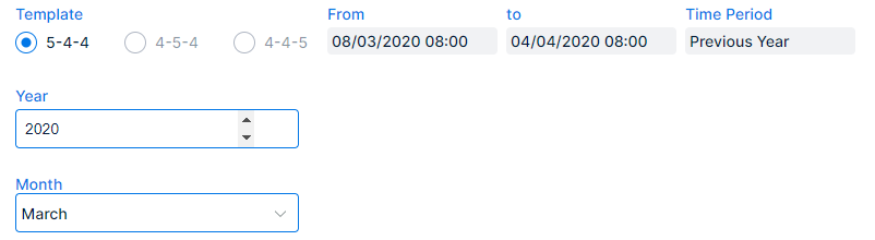
Accounting
Here you can easily select a month of a year according to accounting preferences
- Enable the radio button for the accounting ‘Template‘ that is used to divide a quarter in weeks
- 5-4-4: one quarter = 5 weeks, 4 weeks, 4 weeks
- 4-5-4: one quarter = 4 weeks, 5 weeks, 4 weeks
- 4-4-5: one quarter = 4 weeks, 4 weeks, 5 weeks
- Note that the time range may vary according to the selected radio button
- You can alter the ‘Year‘ by clicking the field and
- Delete/select the current year and enter the year of your choice via the keyboard
- Or use ▲ to go forward 1 year at a time and ▼ to go back 1 year at a time
- You can also select the ‘Month‘ from the drop down menu
- In the ‘From‘ and ‘to‘ fields you can see the period that is going to be used to generate the report
- If you selected a time period in another section this is automatically set here in the field ‘Time Period‘
- To change this go to ‘Custom, Most used, Daily’, etc and set a different time range
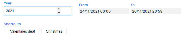
Named periods
Here you can easily select a period that was created with a time range linked to it, e.g. ‘Christmas’
- You can alter the ‘Year‘
- Click the field and delete/select the current entry and alter it via the keyboard
- Or use ▲ to go forward 1 year at a time, or ▼ to go backward 1 year at a time
- Select the ‘Shortcut‘ that represents the named period
- In the ‘From‘ and ‘to‘ fields you can see the period that is defined for the period
Named periods can be created in the ‘Manage App’ section
Parameters
You can select additional parameters that are used to generate the report. Per report type these may vary. Here is an overall description
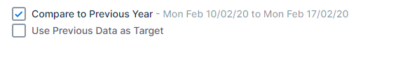
- Compare to Previous Year – enable the checkbox to see a comparison with the data of the previous year for the same time range in the report
- The time range that’s used to compare with is displayed, so you can check whether it’s correct
- To change the comparison time range, simply change the current time range
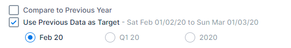
- Use Previous Data as Target – enable this checkbox to set the results of the previous year as target
- The time range that’s used as target is displayed
- You can choose between three radio buttons to further specify the target time range:
- [Month name and year]: data from the same month but in the previous year will be the target
- Feb 20 in the example picture → data from February 2020 is regarded as target data
- Q [currently selected quarter and previous year]: data from the same quarter but in the previous year will be the target
- Q1 20 in the example picture → data from the entire first quarter of 2020 is regarded as target data
- [previous year]: the year before the currently selected time range will be used as target
- 2020 in the example picture → data from the whole of 2020 is regarded as target data
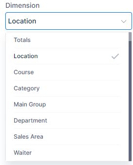
Dimension
- From the drop down menu you can choose a dimension that is used to split up the data in the report
- ‘Location’ shows the totals per location, ‘Course’ shows totals per course, ‘Department’ per department, and so on…
![]()
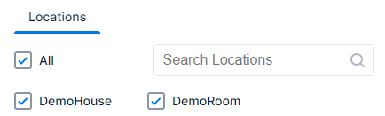
Locations
An overview of all locations is shown
- Enable the checkbox(es) corresponding with the location(s) to which the report will apply
- All: Enable this checkbox to (de)select all locations at once
- Use the search field to quickly find the location(s) you want
When you frequently use the same selection of locations you can also create a customised set of selected locations
![]()
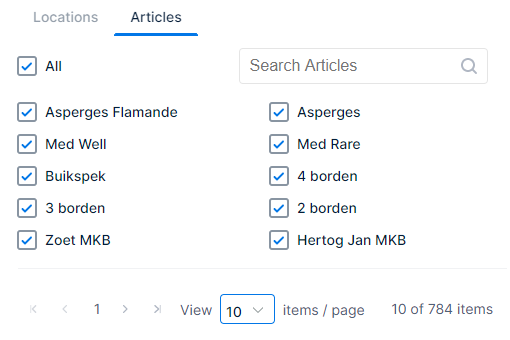
Articles
If you click this tab when it’s available, an overview of all articles in the database(s) of the selected location(s) is shown
- Enable the checkbox(es) corresponding with the article(s) to which the report will apply
- All: Enable this checkbox to (de)select all articles at once
- Use the search field to quickly find the location(s) you want
When you frequently use the same selection of articles you can also create a customised set of selected articles
![]()
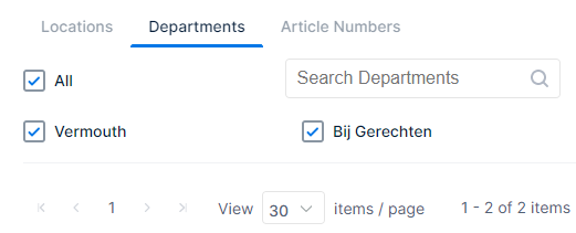
Departments
If you click this tab when it’s available, an overview of all departments in the database(s) of the selected location(s) is shown
- Enable the checkbox(es) corresponding with the department(s) to which the report will apply
- All: Enable this checkbox to (de)select all departments at once
- Use the search field to quickly find the department(s) you want
When you frequently use the same selection of departments you can also create a customised set of selected departments
![]()
Article numbers
If you click this tab when it’s available, you can set the article range according to their corresponding number
- Select the ‘From’ or ‘to’ field by clicking in it and alter the number with the keyboard, or use the up ∧ and down ∨ arrows to change the corresponding numbers
- You can also use the slider to set an article number range
- Drag the circles
 at the beginning and the end across the line to set the article number range
- Drag the circles
![]()
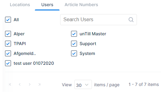
Users
If you click this tab when it’s available, an overview of all users in the database(s) of the selected location(s) is shown
- Enable the checkbox(es) corresponding with the user(s) to which the report will apply
- All: Enable this checkbox to (de)select all users at once
- Use the search field to quickly find the user(s) you want
When you frequently use the same selection of users you can also create a customised set of selected users
Pagination
Because ‘Locations, Articles, Departments, and Users’ may contain too many options to fit the page, they can be divided over multiple pages.
-
- When you are in any of these sections you are able to navigate with the buttons that are below the selection checkboxes❶
- |< this will take you directly to the first page
- < this will take you one page back
- 1 this will take you to page one (2 to page two, 3 to page three, etc)
- … this will show you the next three page numbers (if any)
- > this will take you to next page
- >| this will take you directly to the last page
- You can choose how many items are displayed per page by selecting it from the drop down menu❷
- Which items are currently displayed out of the total number of items is also shown
- In the example picture: you are watching the first 30 items from the total of 164 items❸
1
2
3

Customisation
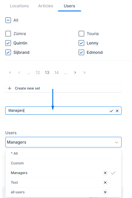
It may be helpful to have a customised selection that can be chosen. With the custom ‘Set’ you can create these for ‘Locations, Articles, Departments, and Users’
- Select the items you want to add to the customised set
- For example ‘Users’:
- ‘Quintin’, ‘Sijbrand’, ‘Lenny’, and ‘Edmond’ ❶
- Select the field ‘✛ Create new set’❷
- A cursor and the text ‘Enter Name’ appears in the field
- Enter a name, so you can easily identify it the next time you want to use it❸
- For example: Managers (if the selected users are managers)
- Use ✓ to confirm the customised selection set
- Use ✕ to cancel
- Next time the basic reports are loaded the customised selection set is available❹
- When you then select ‘Managers’ only the users ‘Quintin’, ‘Sijbrand’, ‘Lenny’, and ‘Edmond’ are used as reference
- The ✕ will remove the customised set. Next time it can’t be selected
This example was with ‘Users’ but it works the same for ‘Locations, Articles, and Departments’
1
2
3
4
Remaining parameters
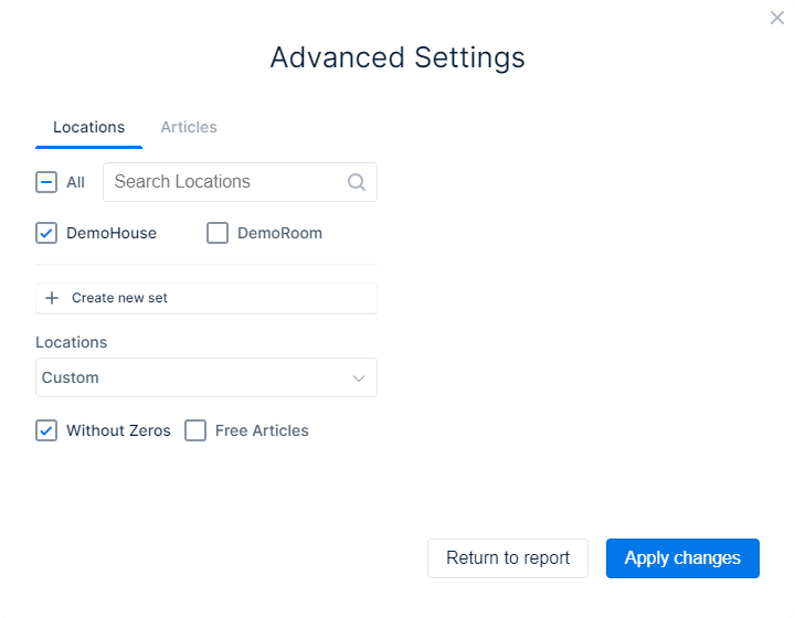
- Without Zeros: enable this checkbox to leave out data without amount
- Free Articles: enable this checkbox to see the articles that have no amount but were added as an option without price
- Cooking instructions such as ‘Rare’ are then also shown in the report when a ‘Steak’ is sold, for example
- Articles that have no value and are ordered/sold separately will not be displayed
- This checkbox is only available when the ‘Without Zeros’ checkbox is enabled
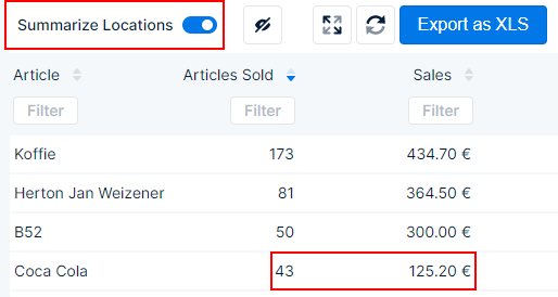
- Summarize Locations: enable this checkbox to see the totals in the report for all locations combined
In the example pictures the same parameters were used, only differences are the ones described below
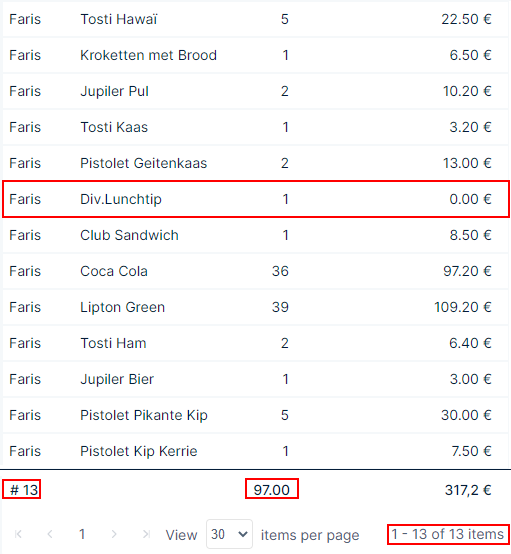
❶Shows an example of a report with the checkbox ‘Without Zeros’ disabled
- As you can see the highlighted item is 0,00 €
- The number of different items is 13
- The total number of items is 97
1
❷Shows an example of a report with the checkbox ‘Without Zeros’ enabled (‘Free Articles’ is disabled)
- The highlighted article of❶is now missing
- The number of different items is 12
- The total number of items is 96
- Logically, the total amount sold remains the same
1
2

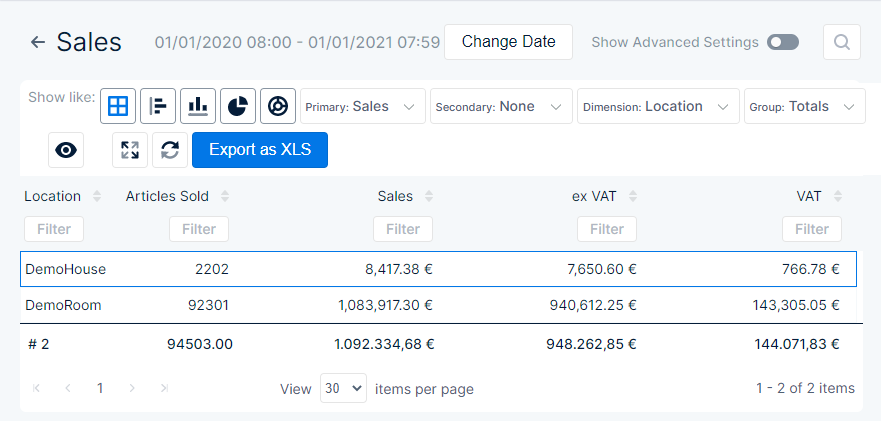
❸Shows a report where the locations aren’t summarised
- You can see the two locations in the left column
- You can see that location ‘DemoHouse’ sold 41 Coca Colas for 119,80 €
1
2
3
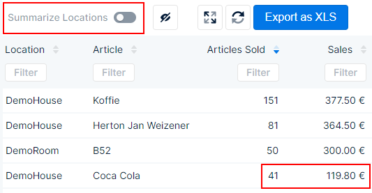
❹Shows a report where the locations are summarised
- No locations are displayed
- You can see that the same article Coca Cola was sold 43 times for 125,20 €. This indicates that, comparing with❸the second location (DemoRoom) sold the other two for 5,40 €
1
2
3
4
Explanation of a generated report
Once the report is generated you can view it. In the report view you can also apply or change most of the parameters. Because it would be too extensive to explain every report in detail, a few examples are given. However the buttons and actions described have the same functions, no matter the report. Which of these are present as choices varies per report
Screen size
The report layout varies according to the screen size in which it is viewed. Compared to the example picture used here, buttons, icons, etc, may therefore be located elsewhere on your screen. There are a few ways you can adjust the data to (better) fit the screen
- When the data is too wide to fit, you can scroll to the bottom of the report. Here you can use the horizontal scroll bar to move the report from left to right and see all data
- This button allows you to view the report in full screen mode
- When this button is displayed, all columns are visible
- When this button is displayed, not all columns are visible. When you press the button you can make columns that are hidden visible
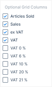 Enable the checkboxes of the columns you want to have displayed and disable the checkboxes of the columns you don’t want displayed. This way you can adjust what data is shown and make it easier to fit narrower screens
1
- You can adjust the width of the columns:
- Move the mouse cursor in the header row of the columns until it changes to the size modifier icon

- Click and hold the mouse button, while dragging the icon to the left or right
- Move the mouse cursor in the header row of the columns until it changes to the size modifier icon
- When the width is less than 1024 pixels, the menus will be collapsed:
- The buttons that can be used in the generated report are in a collapsed menu, which can be opened by clicking < at the top right corner. While the menu is displayed it can be collapsed again with >
- The main menu for WM can be accessed via the hamburger menu

Buttons and filters in report
Per report the different available buttons may vary, in this section a description of what you can do with these buttons
![]()
Shows you the main parameter and time range that is used to generate this report
- Use
 to return to the basic report section
![]() Allows you to change the time range and generate the report again according to it, without returning to the previous page
Allows you to change the time range and generate the report again according to it, without returning to the previous page
![]() Press this button to be able to change the available dimensions for the report❶
Press this button to be able to change the available dimensions for the report❶
- Select the report settings you want to change
- Press
 to generate the report again with the newly selected parameters
 - Press
 to return to the report without changes and as it was originally generated
- Allows you to enter a search string, only applies to exact matches with the primary value (first column)
1
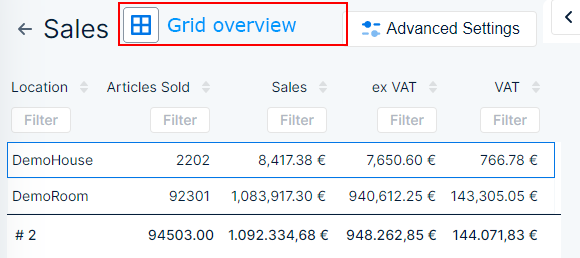
![]() This button displays the generated report in a grid view → this is the default value and it shows the most details
This button displays the generated report in a grid view → this is the default value and it shows the most details
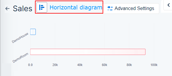
![]() This button displays the generated report as a diagram with horizontal bars
This button displays the generated report as a diagram with horizontal bars
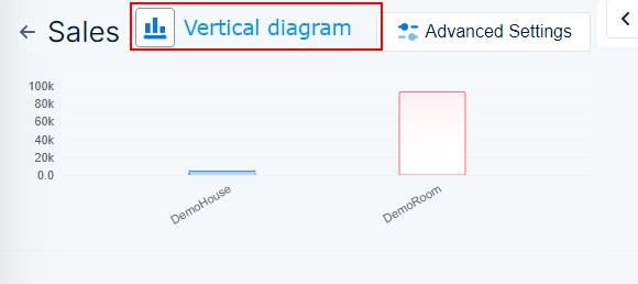
![]() This button displays the generated report as a diagram with vertical bars
This button displays the generated report as a diagram with vertical bars
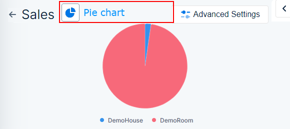
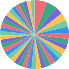
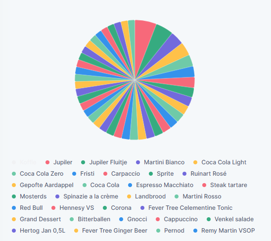
![]() This button displays the generated report as a pie chart
This button displays the generated report as a pie chart
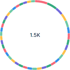
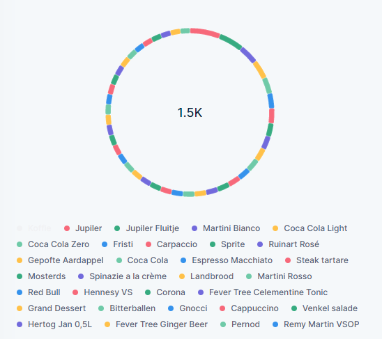
![]() This button displays the generated report as a donut chart
This button displays the generated report as a donut chart
![]() With this button you can manually refresh the data that is displayed in the generated report
With this button you can manually refresh the data that is displayed in the generated report
![]() When you press this button, a .xlxs file of the report is created and downloaded to your downloads folder
When you press this button, a .xlxs file of the report is created and downloaded to your downloads folder
![]() With the slide button you can view the data combined for all locations or data per location
With the slide button you can view the data combined for all locations or data per location
- → with the slider in this position, data for each location is displayed separately
- → with the slider in this position, data of all locations is combined
Grid overview
Horizontal bars
Vertical bars
Pie chart
Donut chart
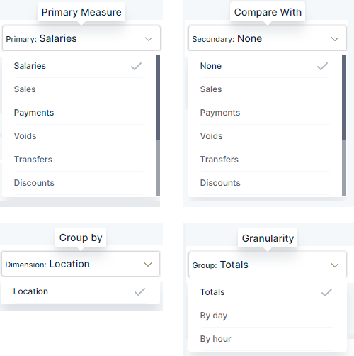
- In many basic reports you also have the option to change the primary value, compare with other data, group the data, and/or change the granularity
- Use the drop down menus in the fields to set a parameter
- Primary → this is the main value you chose to generate the report (e.g. ‘Salaries’), you can change it this way, to another one that is available, without having to return to the ‘Basic report’ page❶
- Secondary → with this field you can set a second value to which the primary value is compared❷
- Dimension → here you can change the grouping of the info❸
- Group → here you can determine how detailed the information is displayed❹
1
2
3
4
- The sequence in which data is presented in a column can also be adjusted by using
 next to the column heading
- The button turns blue when you hover over it with your mouse, otherwise it is grey
 This is the default way in which the button is displayed
- Indication that the info in the corresponding column is not rearranged in a different sequence, another column may be reordered which also influences the data in this column
- The data is arranged from earliest to latest date and time, this is default
 This indicates that the data in the column is set to display in an ascending order (e.g. 1-2-3-4, a-b-c-d, etc)
 This indicates that the data in the column is set to display in a descending order (e.g. 4-3-2-1, z-y-x-w, etc)
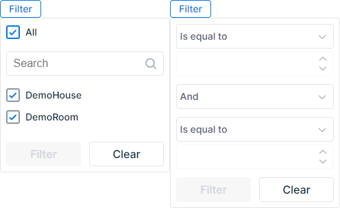
- In various reports you can also apply filters to columns. The conditions you enter in the filter determine what is shown in the generated report
- Press
 to apply it to the corresponding column
 - A drop down menu appears
- You can choose to filter by location❶
- Enable/disable the checkbox for the locations you want to view/hide and press ‘Filter’
- Use ‘Clear’ to reset the filter to default
- And/or set a number of other conditions❷
- Use the drop down menu to choose a condition you want to set
- In the second field you can either enter a number or text (depends on the first condition you set)
- You can also set a second condition
- Set the third field to ‘And’ to apply both conditions
- Set the third field to ‘Or’ to apply one or the other
- Fill the bottom fields with other conditions in the same way as the first two fields
- Press ‘Filter’ to apply the conditions to the column
- Use ‘Clear’ to reset the filter to default
- You can choose to filter by location❶
1
2
- In some reports, ‘Articles per Department’ for example, the details are not immediately visible, but are collapsed and ordered into subdivisions. So that the list is not too extensive and you can choose which details you want to display❶
- In front of a collapsed line an arrow ‘>’ is placed, when you click it the details for this section drop down
- Click the arrow ‘v‘ to collapse the details again
-
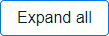 Press this button to expand the details for all collapsed main sections
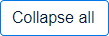 Press this button to collapse and hide the details for all expanded sections
1
Bill preview
In some reports, ‘Bills per waiter’ and ‘Voids per waiter – details’ for example, you can view the bill that belongs to the order. Web Management recreates the bill, which you can then view, download, and/or email
- Expand an element to see its details
- When on the right
 is shown, you can click it to view the bill
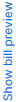
- If you haven’t selected a correct element the following is shown
- If you haven’t selected a correct element the following is shown
- Once the bill is displayed you have a number of options:
- Press
 to download the bill as PDF
 - Press
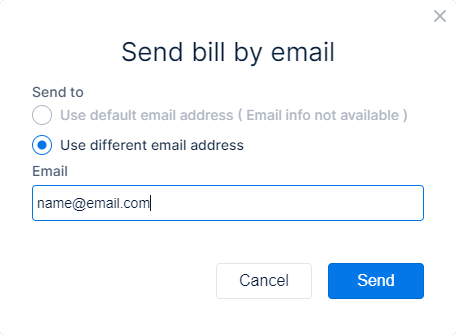
 to mail the bill as PDF, the pop up opens where you can use a default email address, or enter one❶
 - Press
 to be able to add/remove available logos to the bill❷
- Press
- Press
 to collapse the bill preview
1
1
2
Bar diagrams
For most reports you can choose to display the report as a bar diagram. The bars represent the total data for the corresponding item, for the whole time range. Whether you choose vertical![]() or horizontal
or horizontal![]() bars, is of no influence for the represented data
bars, is of no influence for the represented data
- The length of the bars indicate the amount/value of the corresponding item
- The bars are slightly coloured
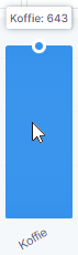
- When you hover the mouse cursor over a bar, it is filled and the total is shown above
![]()
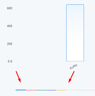
- Default up to the first five items are shown as bars
- When there are more bars that can be displayed, a miniature overview is shown❶
- On the right side for horizontal bars
- On the bottom for vertical bars
- Move the mouse to the area
- When the cursor changes to
 you can click and while holding down the button, draw an area across the miniature bars❷The range of the drawn area corresponds with the number of bars that are displayed
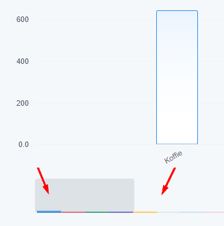
 - When you place the cursor on the highlighted area
 you can move the whole range
 - When you place the cursor on the edge of the highlighted area
 you can click the edge and drag it outwards to make the range bigger, or inwards the decrease the range
- When the cursor changes to
1
1
2
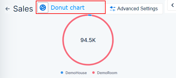
Pie/donut chart
For most reports you can choose to display the report as a pie![]() or donut chart
or donut chart![]() The data for the different items in a pie chart are displayed in a coloured cirkel. Each colour slice represents a separate item. A donut chart is basically the same but only the outer cirkel is used to show the different slices, the center is transparent
The data for the different items in a pie chart are displayed in a coloured cirkel. Each colour slice represents a separate item. A donut chart is basically the same but only the outer cirkel is used to show the different slices, the center is transparent
- When you hover your mouse over one of the colour slices, the total for the item is shown
- Which colour represents which item is shown in the legend❶
- When you click one of the colour items in the legend you can disable them
- The item and colour dot are greyed out and the corresponding slice is removed from the chart
- When you click a greyed out legend item
- The item is no longer greyed out in the legend and the colour slice is shown in the chart
1
1
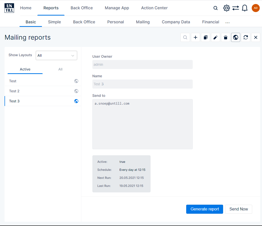
Mailing basic reports
You can have mails of basic reports sent to you regularly and automatically, allowing you to easily view report data without having to login and visit the Web Management user interface
- When you pressin the basic reports frontpage, you are directed to the mailing reports page❶
- This page gives you an overview of all basic report mailings that are scheduled❷
- The more detailed info for the selected mailing is also shown❸
- Show Layouts → from the drop down menu you can choose which reports mailings you want to have displayed in the overview list
- All → all mailings are shown in the list
- Just Mine → only the mailings you created are shown in the list
- Just Public → only the mailings that are publicly accessible are shown in the list
- You can furthermore also differentiate between only showing the Active or All (active + inactive) mailings
- Withyou can view the actual report that is used
- With
 the report is sent immediately
- With this button you can quickly search through the overview list
- Create a new mailing
- Copy the selected mailing
- Edit the selected mailing
- Delete selected mailing
- Set the selected mailing to public
- Public mailings can be recognised by

- Mailings that aren’t public can be recognised by

- Renew the page
- Close the basic report mailings page
1
2
3
Create, edit, copy mailing
Whether you create, edit, or copy an existing mailing, the procedure is basically the same. In this section a walkthrough for this procedure, so you can set a new, or existing mailing to your preferences
- Either press
 (create new),
  (copy selected), or
 (edit selected) to open the mailing setup form
 - The form is divided into separate pages which you have to go through and fill in according to your preferences. On each page a number of buttons is also available:
 Press this when you finished filling in the current page and want to go to the next page
 Press this to return to the previous page
 Press this to cancel the creation/editing of the mailing and close the setup form
 Press this when you to finish the setup of the mailing without entering more parameters
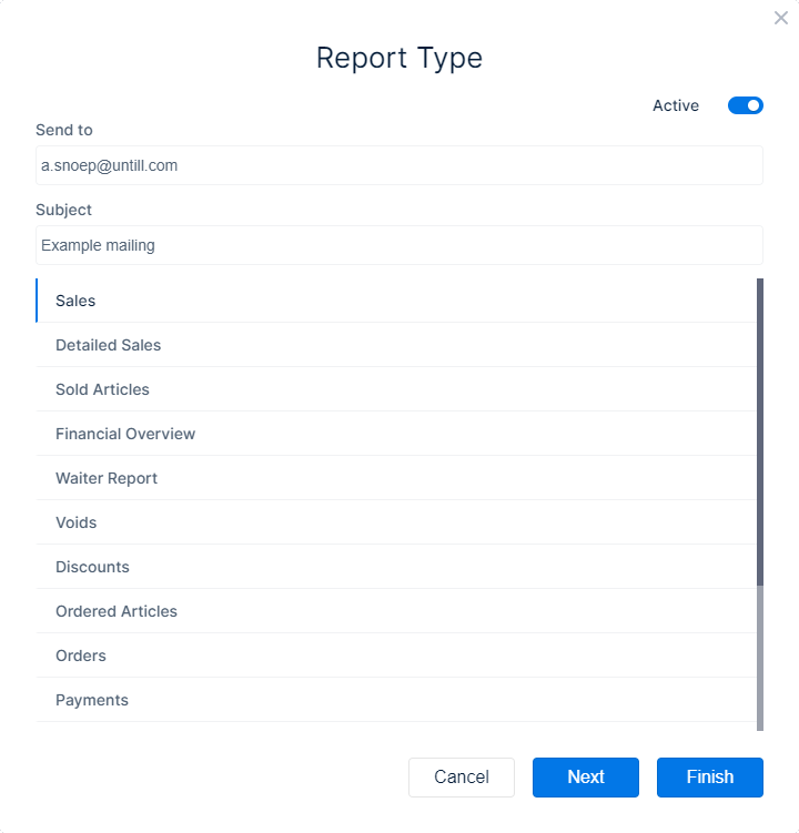
Report Type:
- Send to: enter one or more comma separated e-mail addresses to which the mailing will be sent
- An empty field may cause unexpected behaviour
- Subject: enter a subject with which the mailing can be easily identified
- This field is mandatory, so cannot be empty
- Select the type of report that is going to be generated and sent, from the list
- Default the top one is selected
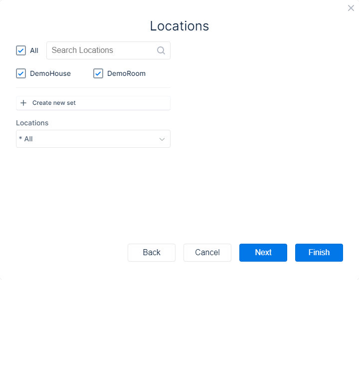
Locations:
- Here you can choose for which locations the report is generated and mailed
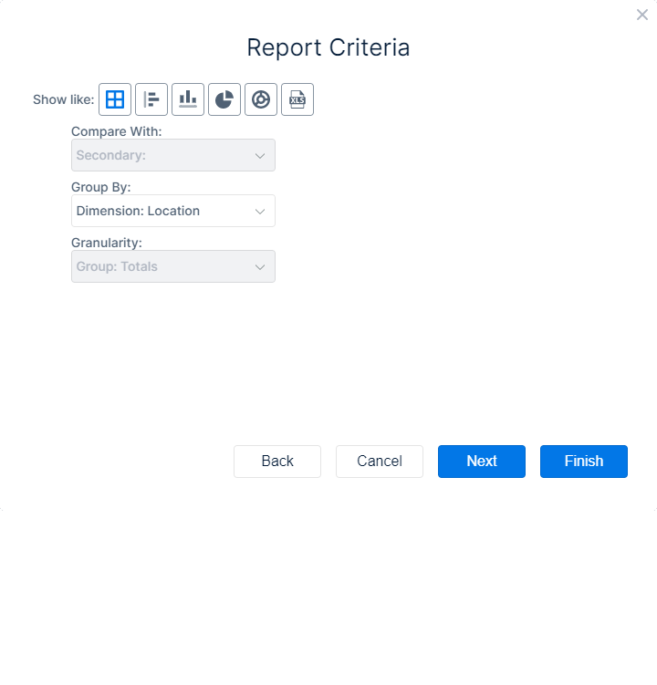
Report Criteria:
- Here you can set how the report is displayed
- Use this button
 to have the report mailed as an XLS attachment
- Use this button
- If available you can also set a secondary parameter with which the data is compared
- If available you can set a dimension to group the data by
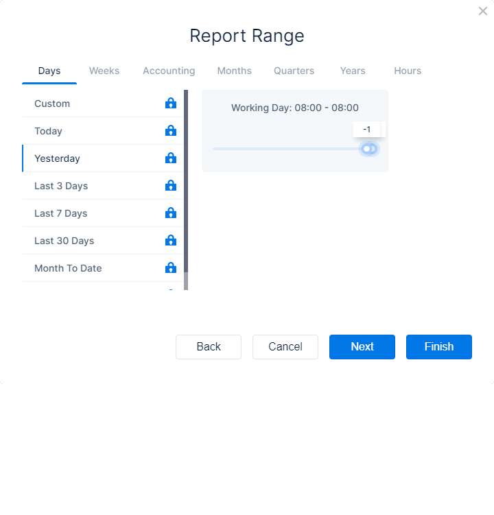
Report range:
- Here you can set the time range that is used to generate the data in the report
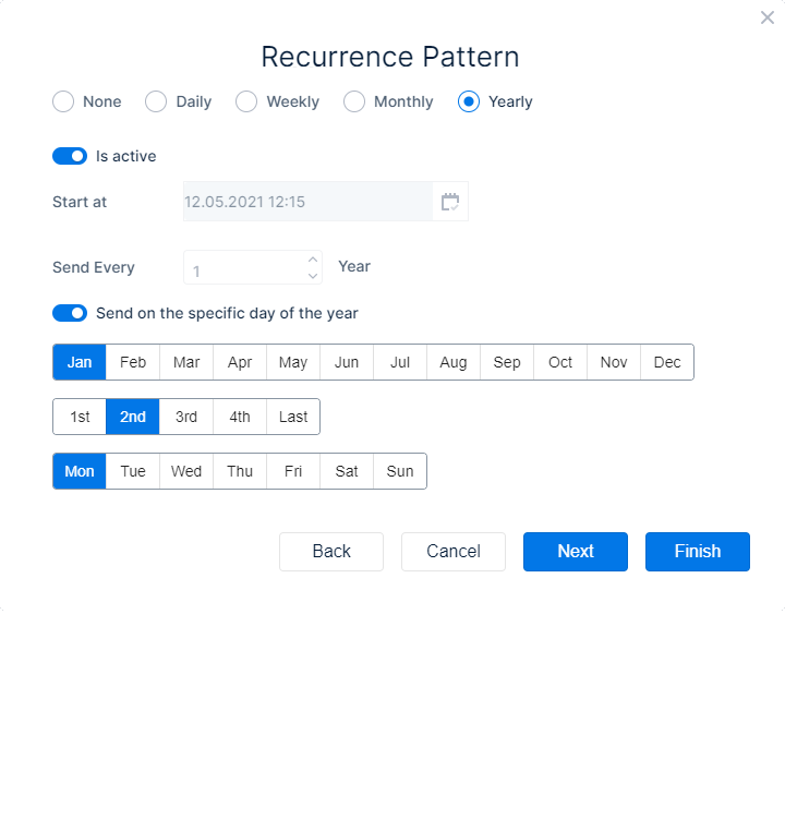
Recurrence Pattern:
- Here you can set the frequency for the mails to be sent
- Enable the radio button for the frequency you want, where ‘None’ means that the mailing is only done once
- With the slider ‘Is active’ you can set a mailing to inactive so that the recurrence pattern is halted until you activate it again. This way you don’t need to discard this mailing when you don’t want to receive them a while (during holidays for example)
- You can set a date and time when the recurrence pattern should start
- Enter the date and time in the field or use the calendar to select a date and time
- In the ‘Send Every’ field you can specify if the report should be mailed every 1,2,3, etc days/weeks/months/years
- Depending on your choice, weekly, monthly, or yearly, you can specify in more detail what the frequency of mailing is
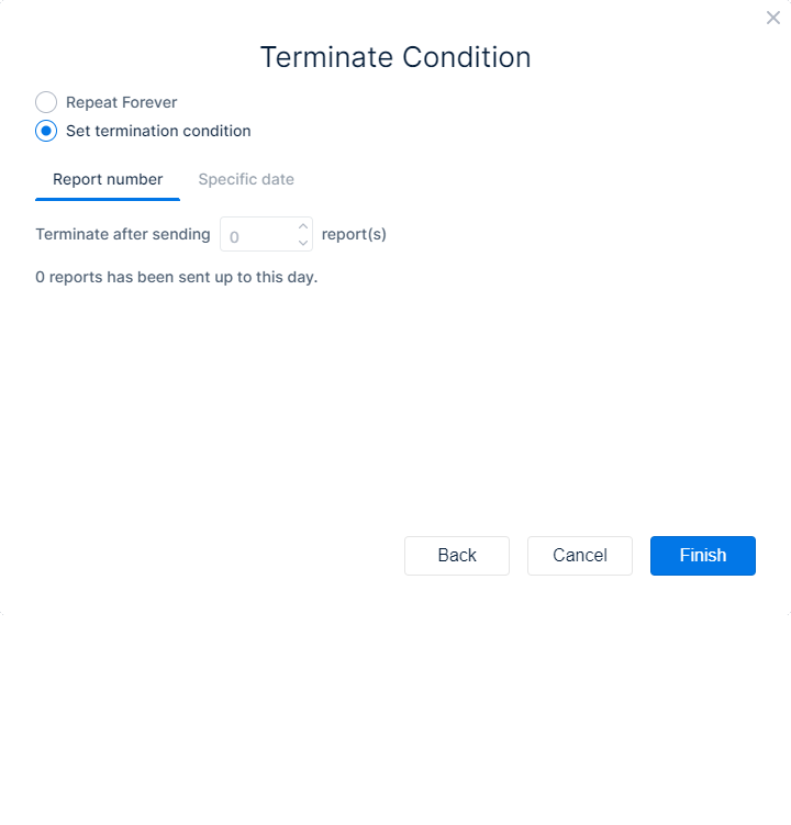
Terminate Condition
- When you enable ‘Repeat Forever’, the mailing is sent until you deactivate or delete it
- When you enable ‘Set termination condition’, you can set a parameter that triggers the end of the maillings
- Report number → here you can set a maximum number of reports that are sent. E.g. 10 then the mailing stops after the tenth report was sent
- Specific date → you can set an end date, after which the mailings will not be sent anymore